How should career centers structure analytics to measure real student outcomes?
Career centers should build analytics systems that connect engagement, readiness, and outcomes into a single pathway. By standardizing data definitions, segmenting student populations, and using predictive signals, teams can move beyond activity reporting and create dashboards that support real decisions, early intervention, and measurable institutional impact.
Most career center dashboards fail at the exact moment they’re needed most - when leadership asks what is actually changing for students.
Teams end up reporting activity instead of outcomes, and decisions get made without a clear link between services, student progress, and results.
That gap has real institutional consequences. Without reliable analytics, it becomes difficult to justify budgets, demonstrate ROI, identify equity gaps, or improve placement outcomes.
Career services risks being seen as operational support rather than a strategic function tied to enrollment, retention, and graduate success.
This guide breaks down how to fix that. It covers how to structure foundational analytics, move from engagement to outcome tracking, design dashboards that support real decisions, apply segmentation for equity, use predictive signals for early intervention, and build governance models that scale responsibly.
What Are Foundational Career Center Analytics?
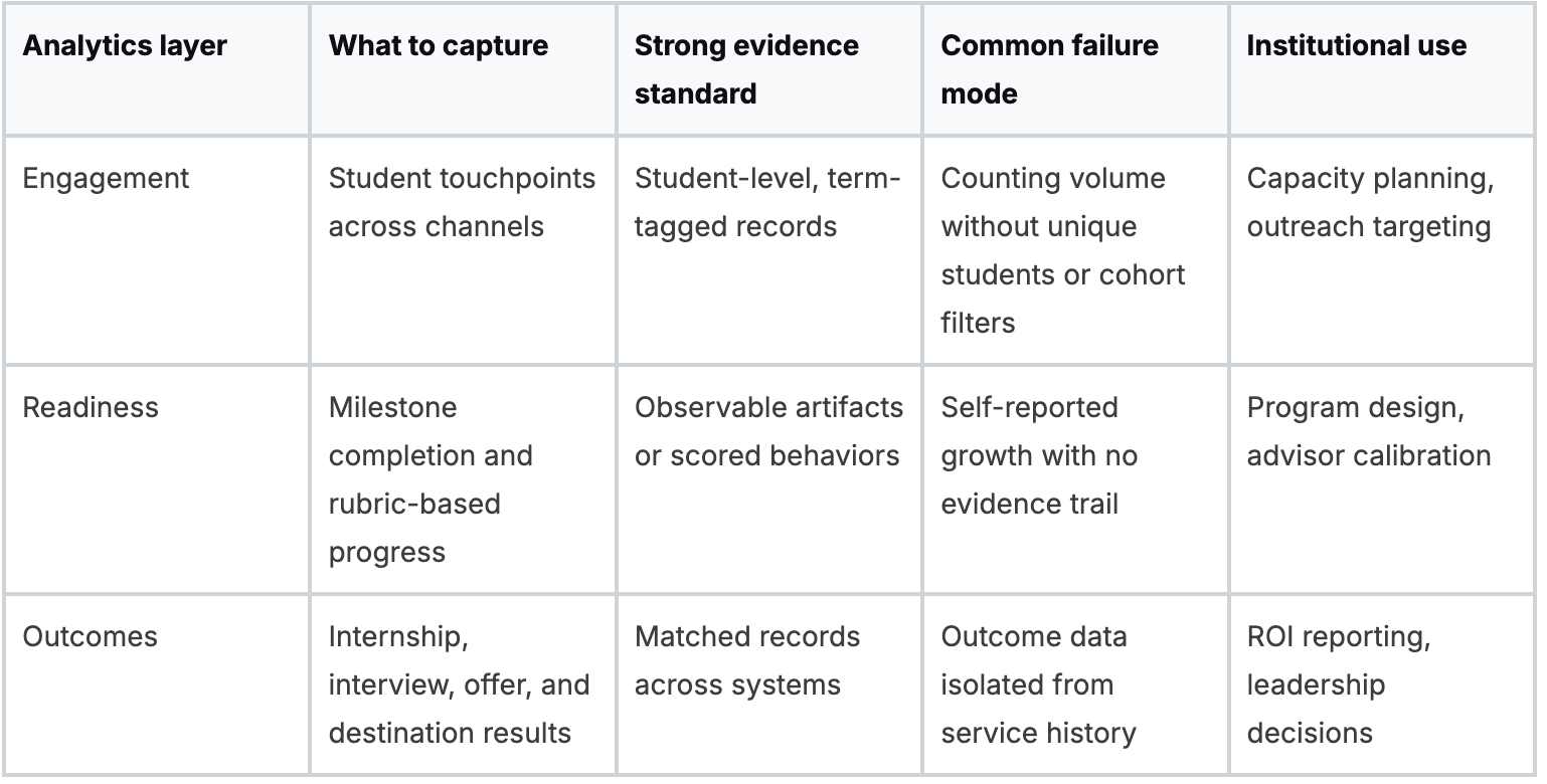
Foundational analytics track who engages, what changes for the student, and whether that change connects to an outcome. Attendance alone is weak. A mature baseline links service usage to observable readiness evidence and then to downstream results such as internship conversion, interview progression, or first-destination outcomes.
The most common failure is overvaluing operational exhaust. Check-ins, workshop RSVPs, and resource views are easy to count, so they dominate reporting. They are still useful, but only as the first layer.
The stronger model uses three connected lenses.
Which metrics belong in the baseline?
- Engagement analytics track service exposure by student, cohort, and term. This includes appointments, workshop participation, employer touchpoints, and digital tool usage.
- Readiness analytics capture evidence that a student changed something. Resume revisions, mock interview performance, completed career milestones, and documented advisor follow-through belong here.
- Outcome analytics connect those patterns to internships, interview progression, offers, and first-destination reporting.
Many centers need a tighter taxonomy in this area. “Resume reviewed” is not enough. “Resume reviewed against a common rubric, revised, and re-submitted” creates a usable progression signal.
Also Read: What KPI benchmarks should career centers track in 2026 to measure real impact?
What works and what often fails?
What works is a compact metric set tied to a service model. What fails is a large KPI menu with no operational owner.
A practical starting framework looks like this:
Georgia Tech is a useful institutional example because its analytics approach is often discussed in terms of integrating data from multiple systems into a broader view of the student journey.
The important lesson is not the warehouse itself. It is the ability to ask dosage questions, such as how many meaningful interactions typically precede an interview-ready student in engineering versus liberal arts.
Track fewer things, but define them more tightly. A smaller dataset with consistent definitions is far more valuable than a sprawling dashboard fed by inconsistent advisor notes.
If your center is rebuilding its baseline, a tighter metric architecture matters more than another visualization layer.
For this reason, many teams revisit their career center metrics framework before buying new reporting tools.
How Do You Move from Engagement to Outcome Analytics?
You move from engagement to outcome analytics by standardizing event and advising data so each student interaction can be matched to readiness evidence and final outcomes. If the systems do not share identifiers, common definitions, and milestone codes, you will keep reporting activity on one slide and outcomes on another.
Most centers own the raw ingredients. The issue is fragmentation. Advising notes sit in one platform. Resume review data sits in another.
First-destination data typically lives elsewhere. Once those systems use a shared service taxonomy, the center can produce a student-level pathway instead of three disconnected reports.
The Outcome-Driven Analytics Framework
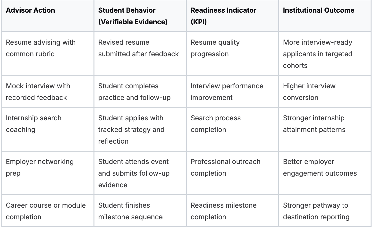
Wake Forest University offers a strong model through its College to Career approach because it ties participation to defined readiness competencies rather than treating programming as standalone activity.
That matters operationally. Once competency evidence is tagged consistently, a director can ask which experiences correlate with stronger internship quality or post-graduation outcomes.
Also Read: Career Center Annual Report Examples for University Leaders
What to standardize first?
Three standards often determine whether outcome analytics will work.
- Service taxonomy. Define categories the same way across advisors and platforms.
- Milestone logic. Decide what counts as completed, attempted, or in progress.
- Student identifier rules. Use a consistent record key across career systems, advising tools, and destination data.
Without that structure, even good data teams waste time cleaning records instead of answering institutional questions.
A second trade-off matters here. Staff typically want nuanced notes, while analytics requires standard fields.
The answer is not to eliminate narrative notes. It is to separate the narrative from the coded fields needed for analysis.
Why this matters for leadership?
Leadership seldom asks how many students attended a workshop. They ask whether the center changed outcomes for priority populations, whether resources are aligned to institutional goals, and whether a program deserves to scale.
That shift is why ROI conversations should begin with matched evidence chains rather than broad satisfaction claims.
A useful reference point is this ROI reporting framework for career centers, particularly if your institution is trying to tie advising operations to enrollment, retention, and graduate success narratives.
If a student interaction cannot be coded into a pathway, it will be hard to defend in budget season.
Also Read: How should career center leaders structure teams, priorities, and data systems for impact?
Why Is Student Segmentation Vital for Equity?
Student segmentation is vital because aggregate performance can conceal serious disparities in who gets access, who progresses, and who converts that progress into outcomes. A center can look effective overall while systematically underserving first-generation students, Pell-eligible students, or students whose barriers become visible through intersectional analysis.

This area is the least developed in many career services analytics practices. Teams segment by major or class year because those fields are readily available. They stop there because the data gets politically sensitive, methodologically harder, and operationally uncomfortable.
But that is where the work becomes institutionally valuable.
According to a 2025 NACE-related claim summarized in this reference, only 28% of career centers use intersectional analytics, intersectional students show 22% lower placement rates, and underrepresented minorities receive 36% fewer interview callbacks despite equal qualifications.
Even with caution about any secondary summary, the directional signal is clear. Average outcomes can hide unequal access to opportunity.
Also Read: What priorities should universities include in a modern career center strategic plan?
Which segmentation model produces useful insight?
A workable segmentation model has three layers:
- Demographic segmentation such as race, gender, socioeconomic status, and first-generation status.
- Academic segmentation such as major, GPA band, academic standing, and degree level.
- Engagement segmentation such as appointment intensity, event participation, and digital tool use.
Value appears when those layers intersect. “Business majors” is descriptive. “First-generation business majors who attend workshops but do not convert to interviews” is actionable.
What schools should ask first?
University of California, Berkeley is a strong example because its career-related equity work has frequently focused on understanding access barriers around experiential opportunities, including unpaid internships.
The useful lesson for peers is that segmented data should lead to resource decisions, not just a more detailed report.
A short institutional question set helps:
- Who is absent from high-value services such as mock interviews, employer introductions, or internship advising?
- Who participates but does not convert to interviews, internships, or offers?
- Which student groups need a different intervention model, not just more reminders?
Southern New Hampshire University is another important example because settings like Career 360 show how analytics, data policy, and operational scale can coexist when institutions build secure tracking models around large student populations.
At that scale, segmentation is not optional. It is how advising avoids becoming generic.
What segmentation should change in practice?
Segmentation should change staffing, communications, and programming design.
- Staffing changes might mean assigning outreach ownership by subgroup rather than by event type.
- Communication changes often involve message timing, modality, and framing by student persona.
- Program changes can include targeted internship funding, dedicated readiness sequences, or advisor-led interventions for cohorts with stalled conversion.
For messaging design, many teams find it useful to pair analytics with student communication patterns such as those in this student personas messaging playbook.
Equity analysis is not an extra reporting layer. It is how a center determines whether its operating model benefits the same students who would have succeeded anyway.
What Predictive Signals Can Proactively Identify At-Risk Students?
The best predictive signals are observable patterns that indicate a student is drifting off the career pathway before the final outcome data arrives. Useful signals are not abstract risk scores. They are behavior changes that advisors can interpret and act on promptly.

Most centers still work retrospectively. They analyze first-destination results after the class has graduated and infer what should have happened months earlier.
Predictive practice flips that sequence. It flags friction while the center can still intervene.
According to Oracle’s analytics reference page as cited in the verified data, a March 2026 pilot across 20 US universities produced 2.5X placement lifts via predictive cohort management, while a 2025 LinkedIn Workforce Report found 65% of career services lack predictive tools, correlating with 40% higher dropout rates in career prep cohorts.
Because these are future-dated or secondary claims, they should be treated as directional signals, but they still frame the operational gap well.
Which signals deserve alerts?
The most useful predictive alerts often come from four categories:
- Engagement decline. A student who was active and then goes quiet is frequently more concerning than a student who never engaged.
- Readiness stagnation. Multiple resume reviews without improvement, or repeated interview practice with the same issues, indicates stalled progression.
- Search inefficiency. High application volume with no interview traction can signal weak materials, poor targeting, or low confidence.
- Missed sequencing. Students who skip key milestones often surface later as urgent cases.
Some centers also monitor a composite “pathway interruption” signal. That can include long inactivity periods, incomplete follow-up after advisor recommendations, or repeated partial completion of readiness tasks.
Also Read: How should universities structure staffing models for modern career centers?
How to operationalize predictive work?
Predictive analytics only matters if it changes workflow. A workable model routes signals to three places:
- Student nudges for low-friction reminders and milestone prompts.
- Advisor queues for students needing direct intervention.
- Manager oversight for cohorts showing broader pattern breaks.
One platform can help if it surfaces individual and cohort patterns in the same workflow.
For example, Hiration combines resume analytics, mock interview data, student tracking, and automated nudges in a counselor dashboard, which makes it easier to move from detection to intervention without stitching together separate tools.
Teams that are refining methodology often benefit from documenting exactly which data methods they are using and why.
What Are the Key Components of a Strategic Career Services Dashboard?
A strategic dashboard needs three views with different decision rights. Deans need institutional impact. Directors need operational performance and cohort progression. Advisors need student-level signals they can act on today. When one dashboard tries to serve all three audiences, it usually satisfies none of them.
The first design rule is to organize around decisions, not charts.
Which views belong in the dashboard?
- Executive view
This layer should stay narrow. It should show institution-level outcomes, subgroup gaps, major-level comparisons, and service-to-outcome connections that matter for planning and budget conversations. - Manager view
Here, directors monitor workflow health. Queue volume, advising completion patterns, cohort progression, and intervention lag belong here. The point is to spot bottlenecks before they become missed outcomes. - Counselor view
Advisors need the smallest level of granularity. They need open tasks, recent changes in student behavior, readiness artifacts, and drill-down access to prior interventions.
According to the EDHEC analytics reference used in the verified data, diagnostic techniques such as root cause analysis and drill-down analysis can reveal workflow disruptions, and targeted intervention can improve key metrics by up to 40%.
That matters for dashboard design because a chart that cannot be drilled into is mostly decorative.
Also Read: How Can Career Centers Evolve for a Skills-First, AI-Driven Job Market?
What a dashboard should allow users to do?
The right question is not “what should we display?” It is “what should a user be able to determine in two clicks?”
A strong dashboard should allow a user to:
- Compare cohorts by demographic, academic, and engagement filters
- Drill from summary to student record without leaving the workflow
- Spot anomalies such as sudden drops in submissions or stalled milestone completion
- Tie an operational issue to a likely cause rather than just showing the decline
That is why the dashboard should include reason codes, standard milestone fields, and intervention timestamps. Without them, managers see only output swings.
Which design choices create trouble?
Three dashboard mistakes appear repeatedly.
- Too many top-line metrics. Users cannot tell which number drives action.
- No cohort filters. Equity and program-level analysis becomes impossible.
- No drill-down path. Directors identify a problem but cannot assign the next step.
A more practical dashboard architecture is outlined in these career center dashboard best practices, particularly for centers trying to balance leadership reporting with advisor usability.
A dashboard earns trust when a director can identify a problem, isolate the affected cohort, and assign an intervention in one sitting.
How Should Career Centers Handle Data Governance and Privacy?
Career centers should handle governance by collecting only data that supports a defined advising or reporting purpose, controlling who can access it, and documenting how each field is used, shared, and retained. Governance is operational design, not legal cleanup after a tool has already been implemented.

The pressure point is familiar. Centers want richer analytics, but every new data field creates privacy, access, and stewardship questions. The answer is disciplined minimization, not paralysis.
According to the StatQuest-linked verified reference, settings such as SNHU’s Career 360 align analytics practices with FERPA/SOC 2 standards and support secure tracking of over 1M+ student interactions.
That is a useful reminder that scale depends on governance maturity, not just software capability.
Which governance controls matter most?
Start with a simple operating set:
- Data dictionary that defines each field, source system, owner, and acceptable use
- Role-based access so advisors, managers, and administrators do not all see the same level of detail
- Retention rules for notes, artifacts, and exported reports
- Vendor review that addresses school official status, contract language, and security documentation
If a center cannot answer why it collects a field, who uses it, and when it should be deleted, that field should not be in the model.
Also Read: How should universities structure a career center technology stack to support scale and outcomes?
What to ask vendors before implementation?
Vendor evaluation frequently gets reduced to a security questionnaire. That is too shallow for career services data.
Ask for:
- A clear description of how student data is processed
- Evidence of FERPA-aligned handling and role separation
- SOC 2 documentation or equivalent controls
- A data processing addendum that matches institutional requirements
- Clarification on model training boundaries if AI features are involved
The practical issue is not only breach risk. It is also function creep. A tool approved for resume review can become a broad behavioral monitoring system if the center does not define limits in advance.
Which implementation model is realistic?
A phased model keeps governance manageable.
Crawl with a small number of fields tied to one service line. Walk by adding matched identifiers and a common taxonomy across platforms. Run when the center introduces predictive flags, subgroup analysis, and broader reporting access.
That sequence is slower than a full-platform launch, but it prevents the common failure of collecting more sensitive data than the team can govern responsibly.
Also Read: Career Services Tech: A Due Diligence Checklist Before You Commit
What Are the Practical Next Steps for Implementation?
The practical next step is to build one analytic use case that changes a real operational decision within a single term. Centers stall when they launch a multi-system transformation before agreeing on the first question the data must answer.
A useful first use case is often one of these:
- Which students engage once but never return
- Which resume review workflows lead to measurable revision
- Which cohorts participate in services but do not convert to interviews
Each question is narrow enough to operationalize and important enough to matter.
A workable rollout sequence
First move: Audit the fields you capture. Identify which ones are reliable, which ones are inconsistently defined, and which ones no one uses.
Second move: Select one pathway. Resume review to interview readiness is often a manageable starting point because it includes clear artifacts, repeated interaction, and visible advisor action.
Third move Create a minimum dashboard for one audience. Do not start with the dean. Start with managers or advisors who can change workflow promptly.
Common objections and the practical answer
- We do not have a data analyst. Most centers can start with better definitions and exports before they need advanced modeling.
- Our systems do not integrate well. Shared identifiers and a basic crosswalk solve more than teams expect.
- Staff will resist coding notes. They resist bad coding schemes. They typically accept concise, decision-relevant fields.
- Leadership wants immediate proof. Then choose a use case with a visible operational outcome in the current term.
The center does not need a perfect analytics stack to become more evidence-driven. It needs a disciplined first win, a cleaner data model, and a governance structure that can support growth.
Also Read: How to Engage Low-Participation Students with Data, Nudges & Personas?
Wrapping Up
Building a strong analytics model is not about adding more tools. It is about creating a system where every student interaction can be tracked, interpreted, and improved in real time.
When engagement, readiness, and outcomes are connected, career centers move from reporting activity to actively shaping results.
That shift becomes much easier when the underlying system supports it. Platforms that combine career assessments, resume optimization, interview simulation, and student tracking in one place reduce fragmentation and make it possible to act on insights without switching between tools.
Hiration is designed around this exact need.
It brings together the full career readiness journey with AI-powered modules and a dedicated counselor dashboard to manage cohorts, workflows, and analytics - within a secure, FERPA and SOC 2-compliant environment.
For teams looking to move from disconnected data to decision-ready insights, that kind of integration can make the difference between observing outcomes and improving them.
Career Center Data Analytics — FAQs
What is the biggest issue with current career center analytics?
Most systems track activity instead of outcomes, making it difficult to demonstrate how services actually change student readiness or career results.
What are the three core analytics layers?
Effective analytics includes engagement data (who participated), readiness data (what changed), and outcome data (what results were achieved).
Why is standardization important for analytics?
Without consistent definitions, shared identifiers, and milestone tracking, data remains fragmented and cannot be linked into meaningful student pathways.
How do career centers move from engagement to outcome tracking?
By connecting advising, program participation, and readiness artifacts to final outcomes such as internships, interviews, and job offers through a unified data model.
Why is student segmentation critical for equity?
Aggregate data can hide disparities. Segmenting by demographic, academic, and engagement factors helps identify which student groups are underserved or not converting to outcomes.
What are predictive signals in career analytics?
Predictive signals are early indicators such as engagement decline, stalled progress, or missed milestones that allow advisors to intervene before outcomes are affected.
What makes a dashboard truly effective?
A strong dashboard is role-based, supports decision-making, allows cohort filtering, and enables drill-down from high-level trends to individual student data.
How should career centers approach data governance?
They should define clear data ownership, limit collection to necessary fields, enforce role-based access, and ensure compliance with privacy standards like FERPA.
What is the best way to start building an analytics system?
Start with one focused use case that improves a real decision, such as tracking resume improvements or identifying students who disengage early.