What should a career center dashboard track to improve student readiness?
Effective career center dashboards measure student readiness rather than activity alone. Instead of focusing primarily on appointments, workshop attendance, or platform usage, they track reviewed student artifacts, milestone completion, readiness progression, advisor interventions, and cohort-level gaps. This gives advisors actionable insights, helps leadership allocate resources, and enables earlier intervention before employment outcomes are determined.
Most career center dashboards show activity.
They count appointments, workshops, event attendance, resume uploads, employer sessions, and platform logins. These numbers help teams understand reach and workload, but they do not show whether students are becoming more prepared.
A stronger dashboard should answer a more useful question: which students are ready, which students are stuck, and what should the career center do next?
This guide explains how career centers can design dashboards around student readiness signals, so teams can see preparation gaps earlier, prioritize advisor outreach, and help students move forward while there is still time to intervene.
| Dashboard question | Weak metric | Stronger student readiness metric |
|---|---|---|
| Are students using career services? | Appointment count | Percentage of students completing readiness milestones |
| Are students improving their resumes? | Resume reviews completed | Resume score improvement and resume approval rate |
| Are students interview-ready? | Mock interviews completed | Percentage reaching proficient level on an interview rubric |
| Are students ready to apply? | Jobs viewed or saved | Completed application packets for target roles |
| Are advisors acting on risk signals? | Advisor notes logged | Flagged students contacted and moved to the next milestone |
| Are cohorts progressing? | Workshop attendance | Cohort-level readiness completion by class year, program, or student group |
What should a career center dashboard actually show?
A career center dashboard should show more than how many students used a service. It should show whether students are moving toward readiness through reviewed work, completed milestones, and advisor-supported next steps.
Activity metrics still have value. They help career centers understand demand, staffing pressure, event reach, and platform usage. But they should not sit alone at the center of the dashboard.
A student may attend three workshops and still have no approved resume. Another student may attend one appointment, revise a resume, complete a mock interview, and create a target-role list. The second student may show stronger readiness even with fewer activity points.
That is why the dashboard needs to separate three ideas:
- Activity: what students used
- Readiness: what students can now produce, explain, or complete
- Outcomes: what happened after preparation
The dashboard should focus heavily on the middle layer. Activity shows reach. Outcomes show delayed results. Readiness shows whether students are making progress while the career center still has time to help.
Which student readiness signals belong on the dashboard?
Student readiness signals should be tied to evidence. The dashboard should not only show that a student completed a task. It should show whether the task moved the student closer to a stronger resume, clearer direction, better interview performance, or a complete application.
NACE defines career readiness as a foundation from which students demonstrate core competencies that prepare them for workplace success and lifelong career management.
That definition is useful for dashboard design because it emphasizes demonstration, not just participation.
According to NACE, career readiness is connected to what students can demonstrate across competencies.
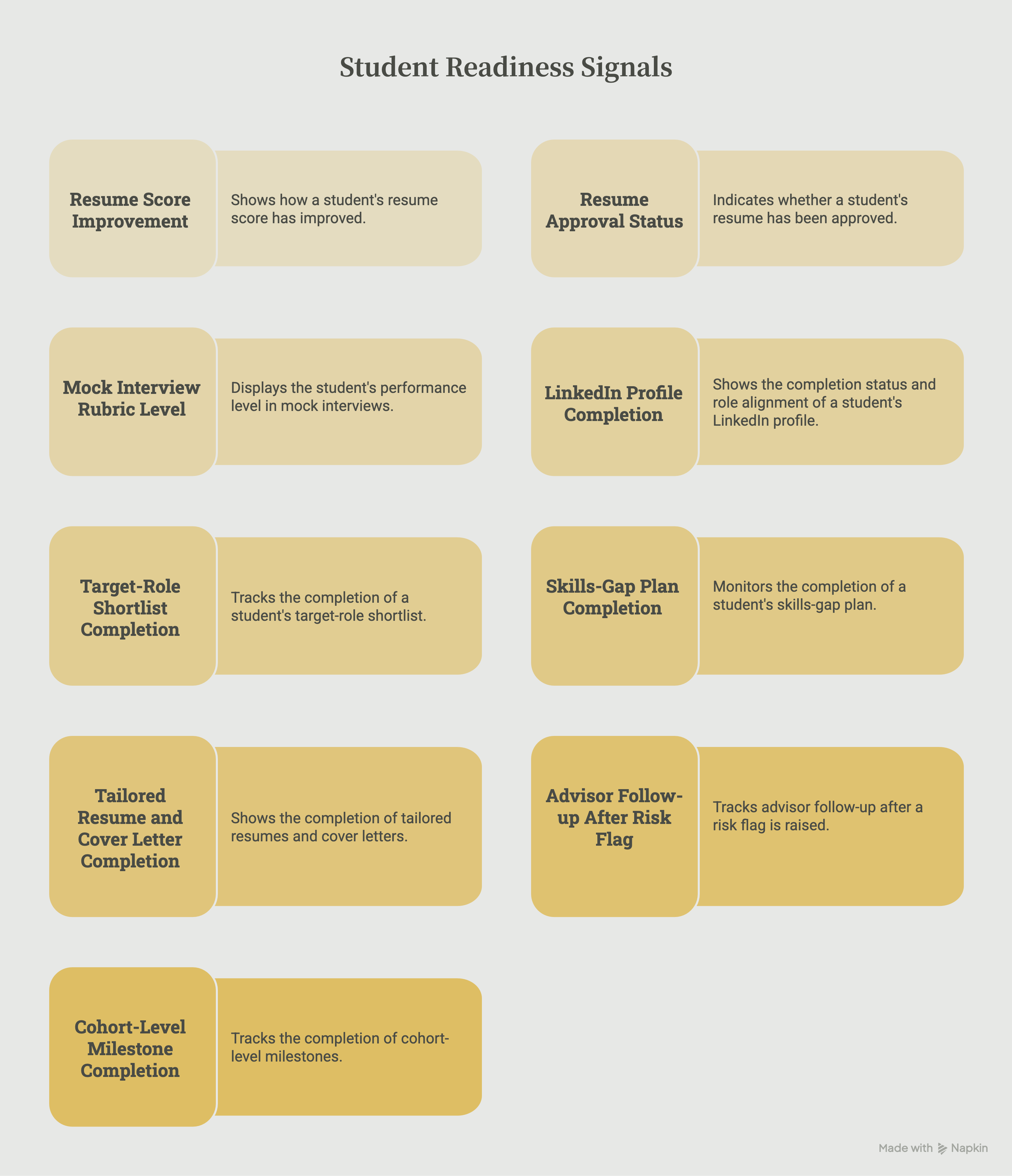
For career centers, that means the dashboard should prioritize signals such as:
- resume score improvement
- resume approval status
- mock interview rubric level
- LinkedIn profile completion and role alignment
- target-role shortlist completion
- skills-gap plan completion
- tailored resume and cover letter completion
- advisor follow-up after a risk flag
- cohort-level milestone completion
This gives the dashboard a clearer purpose. Instead of saying “300 students used the resume tool,” the center can say, “72% of juniors in this cohort now have an approved resume, and the average resume score improved from baseline after review.”
That is a stronger signal because it shows movement.
How can dashboards show student progress instead of participation?
Dashboards show student progress when they compare where students started with where they are now. The goal is not only to count completed tasks. The goal is to show improvement over time.
A resume review, for example, should not appear only as one completed service. The dashboard should show whether the student submitted a resume, received feedback, made revisions, improved the score, and reached an approved level.
The same logic applies to interview preparation. A mock interview count shows usage. A rubric progression shows development.
For example:
- A student who uploads a resume has participated.
- A student who revises the resume after feedback has acted on guidance.
- A student whose resume moves from “needs revision” to “approved” has shown readiness progress.
The same pattern can apply across the student journey:
- A student completes a career assessment, then creates a target-role shortlist.
- A student saves a job, then builds a tailored application packet.
- A student completes one mock interview, then improves from basic to proficient.
- A student attends an advising appointment, then completes the next assigned milestone.
This is where many dashboards fall short. They stop at the first action.
A stronger dashboard follows the student through the improvement cycle:
- The student submits work.
- The student receives feedback.
- The student revises, practices, or reflects.
- The student reaches a defined readiness level.
- The advisor or system assigns the next step.
That cycle turns the dashboard into a working tool instead of a static report.
What should different dashboard views show?
A single dashboard should not show the same information to everyone. Career center leaders, advisors, academic partners, and employer relations teams need different views because they make different decisions.
Career center leadership needs to see whether priority cohorts are becoming more prepared. This view should focus on readiness by class year, college, program, or student group.
It should show where students are progressing, where they are stalled, and where the team may need to adjust programming or advisor capacity.
Advisors need a more tactical view. Their dashboard should work like a support queue. It should show which students need attention this week, which milestones are missing, which students scored below threshold, and which deadlines are approaching.
Academic partners need program-level signals. They may not need individual advising details, but they do need to know where students in their college or course are getting stuck, especially when the institution is building a broader career readiness curriculum map.
For example, they may need to know whether students have completed resume approval before an internship course or mock interview practice before an employer-facing event.
Employer relations teams need readiness signals connected to employer-facing opportunities. They need to know whether students are prepared to apply, interview, and represent the institution well in front of employer partners.
Senior leadership needs a concise view of readiness progress at scale. This view should not be overloaded with raw appointment numbers.
It should summarize whether the career center is helping students move from participation to preparation across the student body.
The advisor view is especially important. If the dashboard only supports leadership reporting, staff may see it as another administrative burden. For advisors, the dashboard should make the next action obvious:
- Which students have not submitted a resume?
- Which students submitted a resume but did not revise it?
- Which students completed a mock interview but scored below proficient?
- Which students are seniors with no approved application materials?
- Which students are engaged but still unclear on target roles?
This keeps the dashboard close to the work advisors already do.
What student artifacts should career centers track?
Career centers should track the student artifacts that best show preparation. An artifact is any piece of student work that can be reviewed, scored, revised, or used for advising.
This matters because dashboards become more useful when metrics are connected to visible evidence.
| Student artifact | What it shows | Dashboard signal |
|---|---|---|
| Resume | Student can explain experience clearly and professionally | Resume score, approval status, revision history |
| Cover letter | Student can connect background to a specific opportunity | Completion status, tailoring quality, advisor review |
| LinkedIn profile | Student can present a professional digital identity | Profile completeness, role alignment, reviewed sections |
| Mock interview | Student can communicate experience in a live or simulated setting | Rubric level, improvement over attempts, feedback areas |
| Career plan | Student has a clear direction and next steps | Target-role clarity, skills gap, action plan completion |
| Application packet | Student can prepare for a real opportunity | Job description, tailored resume, cover letter, checklist |
| Advisor follow-up record | Staff action happened after a risk signal | Outreach date, student response, next milestone completed |
This helps avoid one of the biggest dashboard mistakes: treating self-reported confidence as the main proof of readiness.
Confidence can be useful, but it should not be the only signal. A student may feel confident and still have weak materials. Another student may feel unsure but have strong artifacts and clear next steps.
The dashboard should make the actual work visible.
How should advisors use dashboard flags?
Dashboard flags should help advisors act earlier. They should not exist only to label students as engaged or disengaged.
A useful flag is specific, timely, and tied to a next step. For example, “low engagement” is too vague. It does not tell the advisor what the student needs.
A better flag says:
“Student attended two employer events but has no approved resume and no target-role shortlist.”
That tells the advisor what is happening and what action may be needed.
Career centers can build flags around common readiness gaps:
- No approved resume by the required milestone: send a resume revision task or invite the student to a resume lab.
- Mock interview below proficient: assign targeted practice and advisor feedback.
- No target-role shortlist: send a role exploration activity or schedule a career direction appointment.
- Resume uploaded but not revised: send a reminder with the specific revision step.
- Senior with no application packet: prioritize the student for job-search planning.
- High activity but low readiness: review the advising pathway and clarify the next milestone.
The purpose is not to create more labels. The purpose is to help advisors find the students who need timely support.
How can career centers use dashboards to find cohort-level gaps?
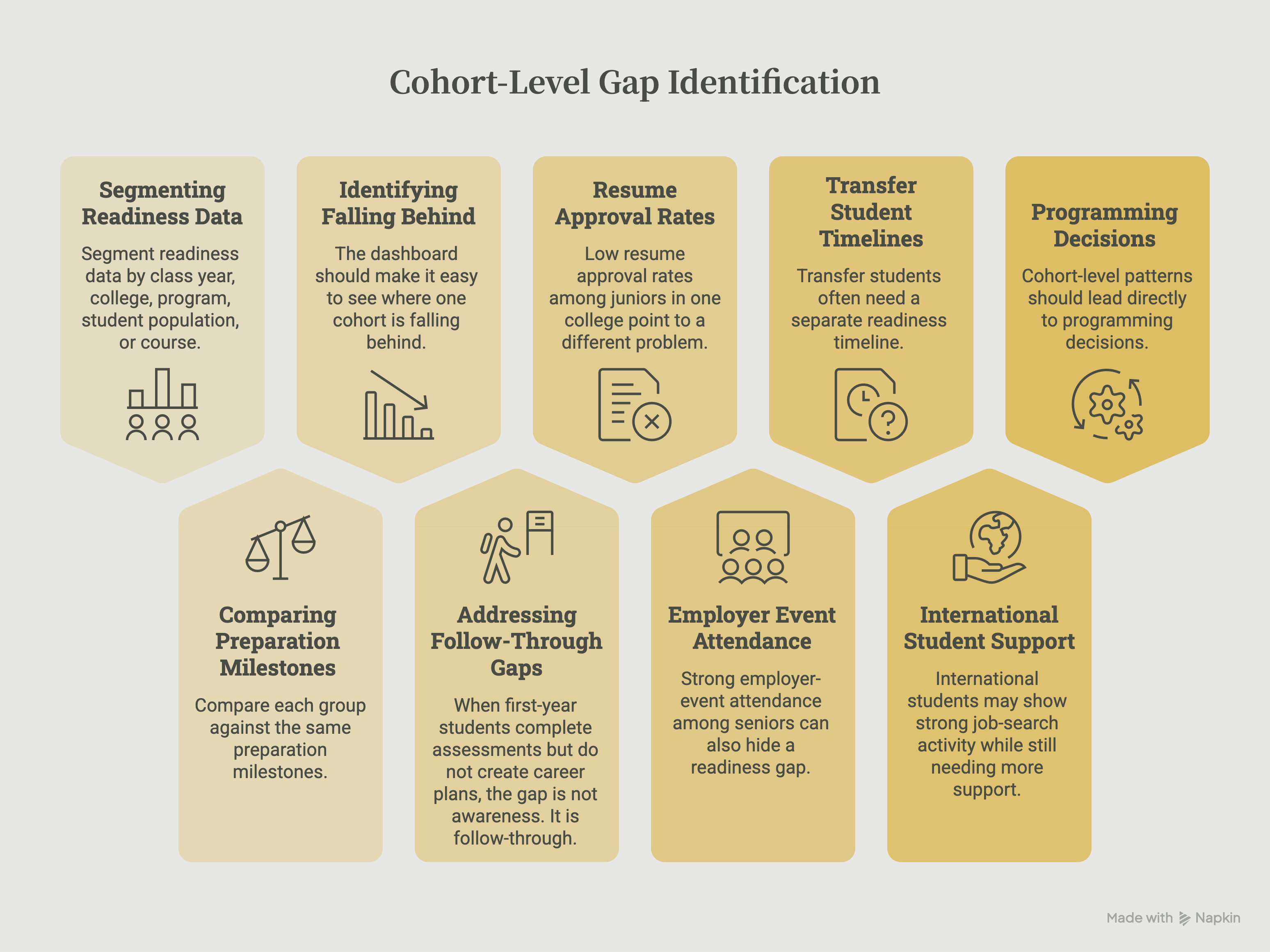
Career centers can find cohort-level gaps by segmenting readiness data by class year, college, program, student population, or course, then comparing each group against the same preparation milestones. The dashboard should make it easy to see where one cohort is falling behind: resume approval, target-role clarity, mock interview completion, application readiness, or advisor follow-up.
When first-year students complete assessments but do not create career plans, the gap is not awareness. It is follow-through. The center can add a reflection activity, role-comparison exercise, or advisor-led planning prompt after the assessment.
Low resume approval rates among juniors in one college point to a different problem. Those students may need earlier resume preparation before internship recruiting begins, especially through course-embedded assignments, targeted labs, or program-specific examples.
Strong employer-event attendance among seniors can also hide a readiness gap. Students may be showing up for employer interaction without completing mock interviews or preparing their application materials.
In that case, the dashboard helps the team add interview practice or application checkpoints before major recruiting events.
Transfer students often need a separate readiness timeline. Missing early milestones may show that they are entering the institution without enough time or guidance to follow the same sequence as continuing students.
International students may show strong job-search activity while still needing more support with role fit, application strategy, communication expectations, or tailored materials.
A dashboard helps career teams see that difference instead of treating job-search activity as readiness.
Cohort-level patterns should lead directly to programming decisions. When the dashboard shows where a group is getting stuck, the center can adjust timing, outreach, assignments, and advising support before the gap becomes harder to close.
What dashboard mistakes should career centers avoid?
The most common dashboard mistake is trying to show too much. When every number is visible, the important signals become harder to find.
A strong dashboard should be simple enough for teams to use every week.
Career centers should avoid these common mistakes:
- Counting every available metric: More metrics do not automatically create better decisions. The primary view should only include metrics that someone will use to act.
- Treating activity as impact: Appointments, events, and uploads show usage. They do not always show whether students became more prepared.
- Using unclear scores: If staff do not know what “approved,” “proficient,” or “at risk” means, they may not trust the dashboard.
- Turning the advisor view into a performance tracker: Dashboards should help advisors support students, not make staff feel monitored. Advisor-facing views should focus on student needs and next actions.
- Waiting only for final outcomes: First-destination and employment outcomes are important, but they often arrive too late for in-semester intervention.
- Ignoring cohort differences: Aggregate numbers can hide gaps by class year, college, program, student group, or pathway.
- Building without advisor input: If the dashboard does not match advisor workflow, it will not become part of regular practice.
EDUCAUSE’s student success analytics framework emphasizes that preparedness, outcomes, analysis, and decisions should be treated as connected parts of a student success effort. For career centers, that means dashboard data should not sit separately from advising decisions.
EDUCAUSE notes that analytics should support decision-making while keeping the human element in view.
A dashboard is only useful if someone can act on it.
What does a simple student readiness dashboard framework look like?
A student readiness dashboard does not need to start as a large, complex system. Career centers can begin with a focused framework that tracks milestones, evidence, status, and next action.
| Dashboard component | What to include | Why it matters |
|---|---|---|
| Student group | Class year, college, program, population, course, or cohort | Shows where readiness gaps are concentrated |
| Readiness milestone | Resume approval, mock interview proficiency, target-role list, application packet | Defines what preparation means |
| Evidence source | Resume, interview recording, LinkedIn profile, cover letter, career plan | Keeps metrics tied to real student work |
| Status | Not started, submitted, needs revision, proficient, approved | Shows where the student is in the process |
| Risk flag | Missing milestone, low score, no revision, approaching deadline | Helps advisors prioritize |
| Advisor action | Outreach sent, task assigned, appointment scheduled, milestone completed | Shows whether the dashboard changed behavior |
| Progress trend | Baseline status compared with current status | Shows readiness movement over time |
This kind of framework gives the dashboard a clear operating rhythm. It helps teams review student progress weekly instead of waiting until final outcomes are collected.
First-destination data remains important, but it is a lagging outcome. NACE’s First-Destination Initiative captures how new college graduates fare within six months of graduation, which makes it valuable for outcome reporting but not sufficient on its own for in-semester advising action.
NACE’s First-Destination Survey standards are useful for post-graduation reporting, while readiness dashboards fill the earlier preparation gap.
Wrapping Up
Career center dashboards should not only show how busy the office has been.
They should show whether students are becoming more prepared.
That means tracking the materials students create, the feedback they receive, the milestones they complete, and the advisor actions that help them move forward. Activity metrics still have a place, but they should not be mistaken for readiness.
A stronger dashboard helps career centers answer practical questions during the semester:
- Which students still need support?
- Which cohorts are falling behind?
- Which preparation milestones are not being completed?
- Which advisor actions are helping students move forward?
This is where the underlying career platform matters. Career centers need more than disconnected activity logs.
They need a way to capture student artifacts, support revisions, track cohort progress, and keep advisor action connected to student readiness.
For that platform layer to work, career centers also need a plan for sustaining adoption and engagement after launch, so dashboard signals reflect real student progress rather than one-time usage.
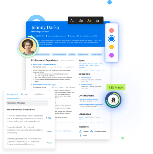
Hiration supports that workflow by helping students build and improve resumes, cover letters, LinkedIn profiles, and interview responses while giving career teams visibility into progress, review status, and cohort-level readiness signals.
When those answers are visible, the dashboard becomes more than a report. It becomes a working system for improving student readiness before final outcomes arrive.
Career Center Readiness Dashboards — FAQs
What is the difference between activity metrics and readiness metrics?
Activity metrics measure service usage, such as appointments or workshop attendance. Readiness metrics measure whether students have improved their resumes, interviews, career direction, or application materials through demonstrated progress.
What student readiness signals should a dashboard include?
Strong dashboards track resume approval, resume score improvement, mock interview performance, LinkedIn completion, target-role selection, skills-gap plans, tailored applications, and milestone completion.
Why should dashboards focus on student artifacts?
Student artifacts such as resumes, cover letters, interview recordings, career plans, and LinkedIn profiles provide observable evidence of preparation that advisors can review, score, and improve over time.
How should dashboards show student progress?
Dashboards should display movement between readiness stages, showing how students improve after receiving feedback rather than simply recording that a service was completed.
Should every user see the same dashboard?
No. Leadership, advisors, faculty partners, and employer relations teams need different views based on the decisions they make, while sharing consistent readiness definitions.
How should advisors use dashboard flags?
Dashboard flags should identify specific readiness gaps, such as missing resume approval, low interview scores, incomplete target-role planning, or stalled revisions, while recommending a clear next action.
How can dashboards identify cohort-level readiness gaps?
By segmenting readiness data by class year, academic program, student population, or college, career centers can identify where preparation is breaking down and adjust programming before recruiting deadlines.
What are the biggest dashboard design mistakes?
Common mistakes include tracking too many metrics, equating activity with impact, using unclear readiness definitions, ignoring cohort differences, and building dashboards that do not support advisor workflows.
How often should career center dashboards be reviewed?
Advisor-facing dashboards are most valuable when reviewed weekly so teams can identify stalled students, assign interventions, and monitor readiness progression throughout the semester.
What makes a career center dashboard effective?
An effective dashboard connects student evidence, readiness milestones, advisor actions, cohort trends, and institutional reporting into a practical decision-making tool that supports earlier intervention and continuous improvement.