Do you actually need two resumes?
Most people frame it as a choice: a good-looking resume or a plain one that survives the software. It isn't a choice. You keep a plain, single-column version for online portals and any system that parses your resume before a human reads it, and you keep a lightly designed version for the moments you hand it straight to a person who asked for it. Same facts, two outputs. When you can't tell who or what reads first, send the plain one.
Somewhere in the last few years, "pretty resume versus ATS resume" turned into a fake fork in the road. People agonize over it like they have to pick a side and live with the consequences. Go plain and boring and maybe blend into the pile. Go designed and risk the software mangling it.
Here is the thing nobody tells you plainly. You don't have to pick. The people who actually screen resumes for a living keep two versions of the same document and send each one where it belongs. One is built to be read by machines and skim-read by busy humans. The other is built for the handful of times your resume lands in front of someone who asked for it by name. That's the whole workflow. Everything below is just the detail.
The false either/or, and why it keeps tripping people up
The panic comes from a real-sounding premise. Applicant tracking software reads your resume before a person does, and if you feed it a two-column template stuffed with icons and text boxes, the parse can come out scrambled. True enough. So the internet's answer became "strip everything, make it ugly, or you're doomed."
But that advice quietly assumes every resume goes through the same door. It doesn't. A resume you paste into a company's careers portal and a resume you attach to an email to a hiring manager who just said "send it over" are travelling completely different roads. The first one gets parsed, keyword-searched, and dropped into a database. The second one gets opened, glanced at, and forwarded to someone who already half-wants to hire you.
The stress comes from trying to make one document survive both jobs. You can't. A file clean enough to parse perfectly is a little plain for a warm hand-off, and a file polished enough to impress a person can trip the parser. So you stop forcing one thing to do two jobs, and you keep two versions matched to their channels.
None of this means the designed version is a vanity project or the plain one is a compromise. Both are correct answers to different situations, and the trick is knowing which situation you're in before you hit send.
The plain version: what it is and where it goes
The plain version is the workhorse. It exists to be read cleanly by software and skimmed fast by a recruiter looking at a hundred other files that afternoon. There's a settled recipe for it, and it's less about looking good than about getting out of the parser's way.
Single column, top to bottom. No tables, no text boxes, no multi-column layouts, no icons or graphics, no photo, no skill bars or rating dots, nothing living in a header or footer. Standard section headings that say what they are: Experience, Education, Skills. A normal font at a normal size. And real, selectable text, not a resume you designed as an image and exported flat.
Why so strict? Because a parser is closer to a search tool than a reader. It walks the text, pulls out fields, and tries to pre-fill a form with your name, your titles, your dates. Give it a clean single column and it reads top to bottom the way you wrote it. Give it two columns and it can read straight across, splicing the left column into the right and turning your work history into word salad. Bury your job title in a text box and it may not find the title at all. Color and shading, oddly, don't bother it much, since it's reading text and not looking at the page. The layout is what breaks things.
Build it in Word or Google Docs and save it as a text-based PDF, or submit the .docx if the form asks for one. Both parse well. What you're avoiding is the fancy template that looks like a magazine spread and reads like static.
Now the part people skip: where this version actually goes. It goes anywhere a machine reads before a human does. Online application portals, first and foremost. Big-company career sites. Anything running on Workday, Greenhouse, Lever, iCIMS, or Taleo, which is to say most large employers you'll apply to. Any "upload your resume" box on a job board. And the honest default: anywhere you genuinely can't tell who or what opens the file first. If you're guessing, guess plain. You almost never lose points for being clean. You can absolutely lose them for being fancy in the wrong room.
One caution that saves a lot of grief. Don't assume a template is safe just because it's labeled "ATS-friendly." Plenty aren't, and plenty of resume generators produce output that looks fine on screen and parses badly. The only way to know is to test the actual file. There's a fast, free way to do that, and it's worth ten minutes before you trust any version to a portal. We walk through the exact tests in our guide on how to check whether your resume is ATS-friendly.
What the software actually does with it (so you stop overthinking)
People have talked themselves into believing the applicant tracking system is a bouncer that reads your resume, scores it, and throws it out before anyone sees it. That's not what it is, and the people who install and run these systems will tell you as much.
Think of it as a filing cabinet with a search bar, not a judge. When you upload, the software parses your file into fields and pre-fills an application form. You review and fix whatever it got wrong, then submit. Those form answers, not the raw resume, are what actually land in the database. If your file scans cleanly, you barely touch the form. If it scans badly, you're stuck retyping half of it, and a garbled parse is a headache more than a death sentence. The recruiter can still open your original file. They usually do.
The reason plain still matters isn't some secret reject button buried in the software. It's that recruiters search that database by title and keyword to pull candidates, and a clean parse plus the right words is what makes you show up in their results. Miss the search and you're not rejected so much as invisible. That's a different problem, and a fixable one. We pulled apart the whole myth in the piece on whether the ATS auto-rejects your resume, and it's worth reading if the software still keeps you up at night. The short version: build clean, use the employer's own words, and stop treating the parser like an enemy.
The designed version: what it is and where it goes
The designed version is not a party trick. It's the file you use when a real person is going to open it on purpose, and a little visual care buys you something a portal never rewards: a first impression that reads as thoughtful.
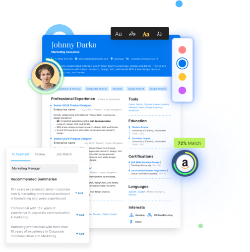
Keep the word "designed" modest. This isn't a Behance entry. It's your clean content with a bit more hierarchy: a slightly bolder name, cleaner spacing, maybe a restrained accent color on the section headers, possibly a second column if the layout genuinely earns it. It should still read at a glance and still say exactly what your plain one says. The goal is a document that looks like you took care, not one that makes the reader hunt for your last job title.
Where does it go? To named humans, mostly. When a hiring manager or a contact says "email me your resume," you send the polished PDF, because it's going straight to their inbox and no parser stands in between. When someone refers you and hands your file to a team, the designed version rides along. You bring or attach the nicer one to interviews. You upload it to your portfolio site. And at a career fair or a walk-in, the printed copy in your hand is the designed one, since nobody's parsing paper.
There's also a category where presentation is part of the pitch. Design, brand, marketing, front-end, anything visual. If you're applying for a job where taste is a skill, a resume that demonstrates taste is doing quiet work. But here's the twist the designers themselves will tell you. Even in creative fields, the resume that goes into a portal gets stripped down, and the real visual proof lives in the portfolio, not the resume. An art director will happily strip their own resume to a boring single column to make sure it gets read, and let the portfolio do the showing off. Presentation matters most where a human sees it first. It matters least in the machine's queue.
And a limit, because over-design is its own failure mode. Progress bars claiming you're "80% proficient" in Python tell a reader nothing and break the parse if that file ever hits a portal. A headshot invites bias you don't want and eats space. Three columns of tiny text read as clutter, not skill. Restraint is the tell of someone who actually knows design. If your "human" version is harder to read than your plain one, you've overshot.
The decision: which channel gets which version
Strip away the theory and it comes down to one question you ask about every application. Does a machine touch this before a person does? If yes, plain. If a specific human opens it first, designed. If you can't tell, plain.
Here's the mapping, and it's short on purpose:
- Online application portal or careers site (Workday, Greenhouse, Lever, iCIMS, Taleo, and every "apply here" form) → plain. A parser runs first, always.
- Any "upload your resume" box on a job board or aggregator → plain. You don't control what reads it downstream.
- Unknown company, unknown system, big employer you've never applied to → plain. Assume software until proven otherwise.
- Emailing a named person who asked for it → designed. It goes straight to their inbox.
- A referral hand-off where your contact forwards the file to a team → designed. A human passes it along.
- Interviews, portfolio, and career-fair or walk-in print → designed. Every one of these is human-first.
- A design-adjacent role where presentation is a signal → designed for the direct touch, plain for the portal, portfolio for the real proof.
Notice how many rows say plain. That's not an accident. Most applications today start at a portal, so the plain version does most of the work, and the designed one comes out for the smaller, warmer set of moments. If you internalize one rule, make it the default: when in doubt, clean beats clever. The cost of a too-plain resume in front of a human is small. The cost of a too-fancy resume in front of a parser can be the whole application.
Two-column layouts deserve a specific word here, because they're the version people fight over most. A single column is the safer default and gives you more room to work. A well-built two-column resume, with the reading order tagged correctly, can parse fine, and plenty of people use one without trouble. The catch is you have to test it, because a badly built one reads straight across and turns your history to mush. If you're weighing the layout itself, our breakdown of one-column versus two-column resumes gets into where each holds up, and the resume format guide covers the format types in full.
Maintaining both without letting them drift
Here's where the two-resume idea usually falls apart. You make a plain version and a designed version, you update one in a hurry before an application, and three months later they disagree. The plain one says you left a job in March, the designed one says May. One lists a promotion the other never got. Now you've got two documents telling slightly different stories about the same life, and that's a real problem, not a cosmetic one.
Why it matters more than it sounds: some employers regenerate a clean, "normalized" copy of your resume internally so every candidate looks the same to the hiring manager, and recruiters do cross-check the file you emailed against the profile you submitted. If your two versions contradict each other, the mismatch is exactly the kind of small inconsistency that reads as carelessness at best and dishonesty at worst. You do not want a dates discrepancy to be the thing someone remembers.
The fix is a mental model, not more effort. Stop thinking of the plain and designed files as two resumes. Think of them as two outputs of one resume. The resume is the content: the words, the bullets, the dates, the titles, the numbers. You keep a single source of truth for that content, and the two versions are just that same content poured into two different shapes. When something changes, you change it once, at the source, and regenerate both. They can never disagree on a fact because they're drinking from the same well.
Done by hand, that means keeping one master file, editing it there, and re-exporting your plain and designed layouts from it every time. It works, it just takes discipline you won't always have at 11 p.m. before a deadline. This is the honest case for a resume builder: it holds your content in one place and lets you export a clean parseable version and a designed version from the same data, so you physically can't have two files that disagree. You edit the content, you pick the layout, and the sync is automatic. If you're tired of babysitting two Word files, building your resume once and exporting both versions is the whole point of the tool.
When you honestly don't need two
Now the counterweight, because this can be over-engineered fast. Plenty of people don't need a second resume at all.
If you apply almost entirely through online portals, which describes most job searches right now, the plain version does everything you need. A clean, well-written single-column resume is not a downgrade. It's the version that actually gets read, and a boring layout with sharp content beats a beautiful layout with vague content every time. Recruiters say it constantly: make the bullets good and they don't care how the page looks.
In that case, the designed version is optional polish for the occasional direct-to-human moment, not a requirement. Don't build a second resume you'll send twice a year and then forget to update. If your search is 95% portals, keep the clean one sharp and only bother with a designed version if and when a warm hand-off actually shows up. Two resumes are a workflow, not a rule. Use it when your applications actually split across channels. Skip it when they don't.
The mistakes people make with two versions
Once you're running two versions, there are a handful of ways it goes wrong. All of them are avoidable.
Sending the designed version into a portal. The classic. Your gorgeous two-column PDF hits a careers site, the parser reads across the columns, and your work history uploads as gibberish that you then re-type by hand while your competitors' clean files sail through. Test the file before it ever meets a portal. Ten minutes with the select-all-and-paste parse test catches this instantly.
Sending the bare plain version to a warm human. The inverse mistake. Someone asks you personally for your resume and you fire off the stripped-down portal version that looks like a tax form. It won't cost you the job, but a little visual care would have made a better impression at exactly the moment impressions count. Match the version to the moment.
Letting the two drift. Covered above, and it's the sneakiest one because it happens slowly. Update the content once at the source, regenerate both, and never hand-patch one file in isolation.
Faking parse-friendliness with tricks. Some people try to have it both ways by hiding keywords in white text or cramming a keyword block into a fancy layout, hoping to game the parser while keeping the look. It backfires, because the parse un-hides exactly the thing you were trying to hide. We took that specific trick apart in why the white-text resume hack gets you rejected. The clean version isn't a workaround. It's the real move.
Over-designing the human version. Skill bars, a headshot, four fonts, dense columns. If your designed resume is harder to read than your plain one, the design is working against you. Hierarchy and white space, not decoration.
The content that carries both versions
Here's the part that outlasts every format debate. Neither version wins on looks, plain or designed. What wins, in the portal and the inbox alike, is what the resume actually says.
A recruiter searching a database and a hiring manager reading an emailed PDF are looking for the same thing, which is evidence you can do the job. That evidence is your bullets: what you actually did, what changed because you did it, said in the employer's own words. A plain resume with strong, specific, results-shaped bullets outperforms a beautiful one full of vague duties, in the portal and in the inbox both. If your bullets are soft, no layout saves them, and if they're sharp, the plain version is already most of the way there.
So spend your energy where it compounds. Get the content right once, at the source, and it makes both versions strong at the same time. Two places worth the effort: proving your impact with real specifics, which we cover in how to quantify achievements when you don't have hard numbers, and building a skills section that a recruiter's search can actually find, which we get into in where your skills section goes and what belongs in it. Fix the content, and the plain-versus-designed question shrinks to what it always was: a formatting decision, not a fork in your career.
Where this fits in how hiring actually works
Zoom out and the two-version workflow is a small, sane response to a system with two doors. Some applications reach a person only after software has read and filed them; others land in a human's inbox with nothing in between. You're not choosing between those doors. You're matching your resume to whichever one this application walks through.
That's the same logic running through the whole hiring process, which stacks a machine layer and a human layer at nearly every stage. If you want the full map of who reads what and when, from the portal to the offer, our walkthrough of how hiring actually works lays it out end to end. The two-resume habit is one piece of that: know the door, send the right version, keep them honest with each other, and stop losing sleep over a choice you never had to make.
Frequently Asked Questions
Do I really need two versions of my resume?
Only if your applications split across channels. If you apply mostly through online portals, one clean single-column version does the job. Add a lightly designed version when you start emailing your resume to named people, getting referred, or interviewing, since those go straight to a human. If those moments are rare for you, keep the plain one sharp and skip the second file.
Which version do I upload to a company's careers site?
The plain one, every time. A parser reads your file first on any portal running Workday, Greenhouse, Lever, iCIMS, Taleo, or the like. Give it a single-column layout with real text and no tables or graphics so it fills the form correctly. The designed version is for inboxes and hands, not upload boxes.
Is a two-column resume automatically bad for the software?
No, but it's riskier. A single column is the safer default because a parser reads it top to bottom the way you wrote it. A two-column file can read straight across and scramble your history if the reading order isn't built correctly. A well-constructed two-column resume can pass, so if you use one, test it before trusting it to a portal.
What exactly makes a resume "ATS-safe"?
Single column, standard fonts, standard section headings, and real selectable text. No tables, text boxes, multi-column layouts, icons, graphics, photos, skill bars, headers or footers. Build it in Word or Google Docs and save a text-based PDF, or submit the .docx. Color doesn't bother the parser much, but the layout does, so keep it clean.
Won't a plain resume look boring and blend in?
A little, and it doesn't matter. Recruiters are reading for evidence you can do the job, not admiring the layout. Boring format with strong, specific bullets beats a beautiful page full of vague duties. Put your effort into what the resume says, and the plain version does more than fine.
When should I send the designed version?
Whenever a specific person opens your resume on purpose. Emailing a hiring manager who asked for it, a referral where your contact forwards it, interviews, your portfolio site, and printed copies for a career fair or walk-in. All human-first, no parser in the way, so a little polish earns you a better first impression.
I'm in a creative field. Doesn't my resume need to look designed?
For the direct-to-human touch, yes, a resume that shows taste helps. But the version you upload to a portal still gets stripped down so it parses, and your real visual proof belongs in the portfolio, not the resume. Even art directors keep a plain resume for applications and let the portfolio do the showing off.
How do I keep both versions from contradicting each other?
Stop treating them as two resumes. Treat them as two outputs of one set of content. Keep a single source of truth for your words, dates, titles, and bullets, then regenerate both versions from it whenever something changes. That way they can't disagree on a fact. A builder that holds your content once and exports both layouts removes the hand-syncing entirely.
What happens if I send the wrong version to the wrong place?
Send a designed file into a portal and the parse can garble your work history, forcing you to re-type it while cleaner files sail past. Send a bare plain file to a warm contact and you miss a chance to look polished at the moment it counts. Neither is fatal, but both are easy to avoid by asking one question: does a machine read this first?
Can I just use one nicely designed resume everywhere?
You can try, but it forces a compromise. A file clean enough to parse well is a touch plain for a warm hand-off, and a file polished enough to impress a person can trip the parser. That tension is exactly why two versions exist. If you only ever want one, make it the clean one, since it works in more places and loses you the least.