How can career centers build a First Destination Survey dashboard that proves institutional value?
Career centers can build stronger FDS dashboards by moving beyond basic employment rates and designing systems that show ROI, equity gaps, salary outcomes, employer pipelines, and stakeholder-specific insights. Effective dashboards combine NACE-compliant metrics, interactive visualization, segmentation, and governance to transform graduate outcomes data into a strategic institutional asset.
Many career centers collect First Destination Survey data, but fewer turn that data into a dashboard that leaders, deans, advisors, admissions teams, and employer relations staff can actually use.
A basic employment percentage is not enough.
It does not show whether the data is credible, which programs need support, where equity gaps exist, which employers are hiring graduates, how salaries vary by field, or where students are still seeking outcomes.
That is why a First Destination Survey dashboard needs to do more than report a single outcome rate.
It should help career centers explain graduate outcomes clearly, support institutional decision-making, protect student privacy, and guide action after the survey closes.
This guide provides a practical FDS dashboard template for career centers, including recommended sections, NACE-aligned metrics, KPI tiles, stakeholder views, filters, data fields, privacy rules, visualizations, and build steps.
What should a First Destination Survey dashboard show?
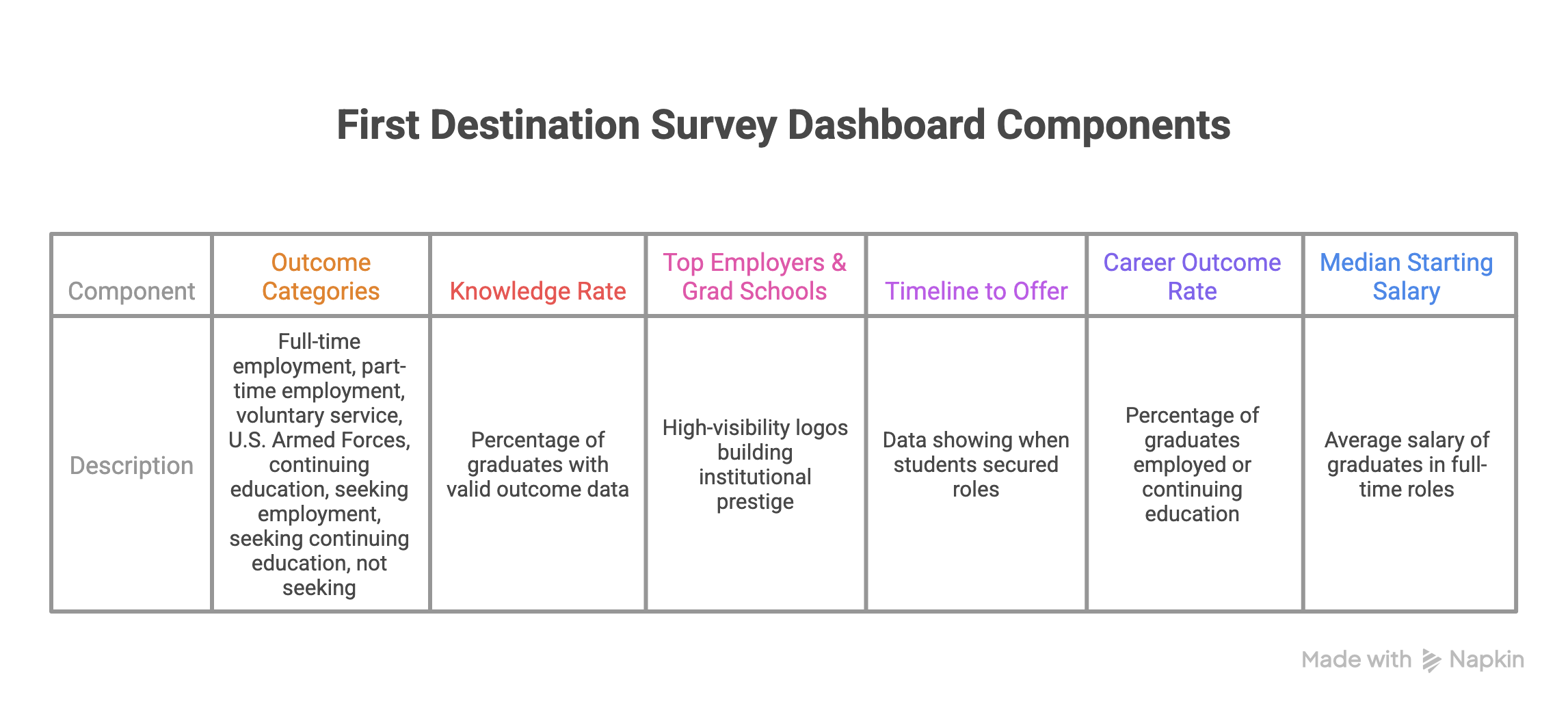
A First Destination Survey dashboard should show where graduates go after completing their degree, how complete the institution’s data is, and what the outcomes mean for different stakeholders.
At minimum, the dashboard should show:
- Total graduates in the reporting cohort
- Knowledge rate
- Career outcome rate
- Outcome breakdown by NACE category
- Employment and continuing education details
- Salary data where appropriate
- Top employers and graduate schools
- Geographic destinations
- Program, college, and major-level filters
- Methodology, formulas, and reporting window
- Privacy and small-sample suppression notes
NACE Standards and Protocols defines knowledge rate as the percentage of the graduating class for whom an outcome destination is known. That includes graduates who are employed, in service, in the military, continuing education, still seeking an outcome, or not seeking an outcome.
They also recommend reporting career outcome rate together with knowledge rate because an outcome percentage is only meaningful when readers know how much of the graduating class the institution has outcome information for.
That pairing should sit near the top of the dashboard.
A 90% career outcome rate with a weak knowledge rate tells a very different story from a 90% career outcome rate with strong data coverage.
Also Read: What should career center dashboards actually measure to prove institutional impact?
First Destination Survey Dashboard Template: Sections to Include
Use this structure as the core FDS dashboard layout.
| Dashboard Section | What to Include | Why It Matters |
|---|---|---|
| Header | Class year, reporting window, total graduates, survey response count, knowledge rate, and data-collection end date | Establishes scope, context, and confidence in the reported outcomes |
| KPI Tiles | Knowledge rate, career outcome rate, full-time employment rate, continuing education rate, median salary, and internship participation rate where available | Provides leadership and public audiences with an immediate summary of outcomes |
| Outcome Breakdown | NACE-aligned categories such as employed, continuing education, military, service, seeking employment, and not seeking | Shows nuance beyond a single employment metric and reflects varied post-graduation pathways |
| Program Filters | College, department, major, degree level, student population, internship participation, and other relevant segments | Allows deans, advisors, and institutional leaders to analyze outcomes by subgroup |
| Employer View | Top employers, industries, job functions, hiring volume, and geographic locations | Supports employer-relations strategy, recruitment messaging, and program storytelling |
| Continuing Education View | Graduate schools attended, degree programs pursued, fields of study, and institution destinations | Captures important success outcomes beyond employment |
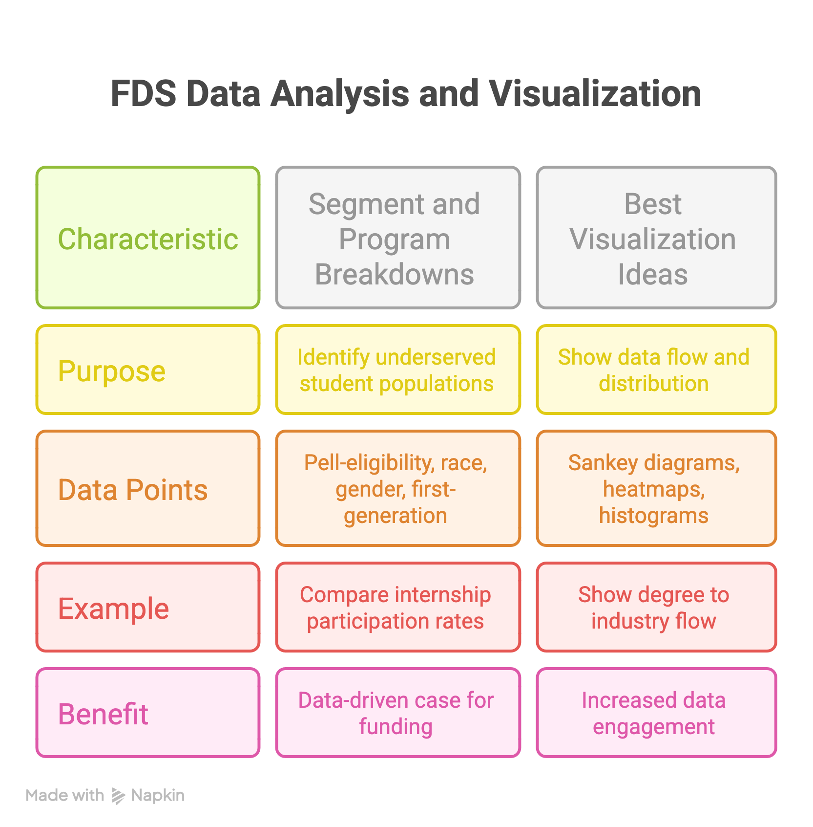
| Equity View | Outcomes by student group, first-generation status, Pell eligibility, race/ethnicity, gender, international/domestic status, and other approved categories | Helps identify participation and outcome gaps that aggregate reporting may conceal |
| Salary View | Median salary, salary bands, salary by industry, salary by location, and salary by major where sample size permits | Provides transparency into economic outcomes while preserving appropriate context |
| Methodology Footer | Definitions, formulas, data sources, collection period, suppression rules, sample-size notes, and NACE alignment details | Protects trust, improves comparability, and helps stakeholders interpret results correctly |
The dashboard should start simple.
A reader should understand the headline outcome in five seconds, then have the option to explore details by program, student group, employer, industry, or location.
Which FDS Metrics Should Career Centers Use?
Career centers should use a small set of consistent, NACE-aligned metrics before adding custom views.
The most important metrics are knowledge rate, career outcome rate, outcome breakdown, continuing education rate, full-time employment rate, still-seeking rate, and salary where available.
Knowledge rate
Knowledge rate shows the percentage of graduates for whom the institution has reasonable and verifiable outcome information.
This metric should appear near every outcome summary because it tells readers how complete the data is.
Career outcome rate
Career outcome rate shows the percentage of graduates with known outcomes who are employed, continuing education, serving in the military, or participating in service.
Avoid presenting this number without context. It should appear alongside knowledge rate and methodology notes.
Outcome breakdown
A strong dashboard should not collapse every outcome into one number.
It should show how many graduates are:
- Employed full time
- Employed part time
- Continuing education
- Participating in service
- Serving in the military
- Seeking employment
- Seeking continuing education
- Not seeking
NACE’s standards provide the common structure career centers use to keep FDS outcomes comparable across institutions.
Still-seeking rate
This is one of the most useful internal metrics.
Students still seeking employment or continuing education are not just a reporting category. They are an intervention group.
Career centers can use this view to plan follow-up outreach, late-cycle advising, resume support, employer introductions, or alumni referral campaigns.
Median salary
Salary data can be valuable, but it needs careful handling.
Median salary is often safer than average salary because it is less distorted by outliers. For public dashboards, salary bands or ranges may be more appropriate than exact figures, especially for small programs.
What Formula Notes Should the Dashboard Include?
Every FDS dashboard should include a methodology note or footer that explains formulas in plain language. Use a simple formula block like this:
Knowledge Rate
Graduates with known outcomes ÷ total graduates in the reporting cohort
Career Outcome Rate
Graduates employed, continuing education, in service, or in the military ÷ graduates with known outcomes, excluding those not seeking
Still-Seeking Rate
Graduates seeking employment or continuing education ÷ graduates with known outcomes
Median Salary
Middle reported salary among graduates who reported salary data, usually limited to full-time employed graduates where sample size allows
The methodology note should also state:
- Class year
- Reporting window
- Collection end date
- Data sources used
- Whether salary is self-reported
- Whether outcomes are based on survey responses, verified sources, or both
- Any small-cell suppression rules
This protects the dashboard from misinterpretation.
According to the NACE First Destination for the Class of 2022 Report, the national average knowledge rate was 54.7%, while the career outcome rate stood at 86.1%.
Real-world examples of excellence include:
- University of Pennsylvania: Their dashboard clearly displays a 93% career outcome rate for the Class of 2023, immediately establishing authority.
- University of Notre Dame: They achieve a staggering 99% knowledge rate by integrating the survey into the graduation application process, a gold-standard tactic.
How do you customize FDS views for different stakeholders?
One size does not fit all when it comes to data visualization. Deans require program-specific ROI data to justify faculty hiring; Admissions teams need "success stories" for brochures; and Employers need to see where the talent gaps are. Your template must allow users to toggle between these specific personas.
According to research by the University of Texas at Austin, their "Texas Career Engagement" dashboard allows stakeholders to filter by "College" and "Department," which empowers academic leaders to take ownership of their students' success.
| Stakeholder | Primary Need | Suggested Dashboard Tab |
|---|---|---|
| Academic Deans | Program ROI & Accreditation | Major-specific salary trends, industry placement, and accreditation-aligned outcomes. |
| Admissions | Graduate employability and parent confidence | Interactive employer and geographic outcomes map showcasing career success. |
| Employers | Talent pipeline visibility | Graduate counts by major, industry entry, and hiring pipeline insights. |
| CSPs | Internal strategy and operational planning | Internship-to-full-time conversion rates, readiness trends, and program performance. |

How Should Career Centers Build Public vs Internal FDS Views?
Not every FDS dashboard view should be public. Public dashboards should communicate outcomes responsibly. Internal dashboards should help career centers, academic leaders, and institutional research teams identify where support is needed.
| Dashboard Version | Primary Audience | What to Include |
|---|---|---|
| Public Dashboard | Prospective students, families, employers, alumni, and public visitors | Career outcome rate, knowledge rate, top employers, graduate schools, salary ranges, employment locations, outcome highlights, and methodology notes |
| Internal Dashboard | Career center staff, advisors, deans, institutional research, and student-success teams | Program-level filters, still-seeking students, equity gaps, internship participation, readiness milestones, engagement trends, and intervention priorities |
| Leadership Dashboard | Provosts, deans, enrollment leaders, advancement teams, and senior administrators | Multi-year trends, program comparisons, strategic risks, employer demand patterns, equity insights, budget implications, and leadership recommendations |
| Advisor Dashboard | Career services staff, career coaches, employer-relations teams, and advising managers | At-risk student groups, still-seeking patterns, major-level gaps, readiness progress, follow-up priorities, appointment demand, and cohort intervention opportunities |
Public dashboards should prioritize clarity and privacy.
Internal dashboards can include more detail, but they still need access controls, small-cell suppression, and clear rules for who can see student-level or program-level information.
What Fields Should Be Included in the FDS Dashboard Data Dictionary?
A data dictionary helps the dashboard stay consistent from year to year. It also helps new staff, institutional research partners, and leadership users understand what each field means.
| Field | Definition | Dashboard Use |
|---|---|---|
| Total Graduates | Number of graduates included in the reporting cohort | Provides denominator context for all outcome calculations |
| Class Year | Graduation year or reporting cohort | Supports filtering, benchmarking, and trend analysis |
| Knowledge Rate | Percentage of graduates with known post-graduation outcomes | Measures data completeness and reporting credibility |
| Career Outcome Rate | Percentage of known graduates in employment, military service, volunteer service, or continuing education | Serves as a headline success indicator |
| Full-Time Employed | Graduates employed in full-time positions | Supports employment outcome breakdowns |
| Part-Time Employed | Graduates employed in part-time positions | Provides additional employment context |
| Continuing Education | Graduates enrolled in degree, certificate, or other formal education programs | Captures graduate school and education outcomes |
| Seeking Employment | Graduates actively seeking employment at the time of reporting | Supports intervention planning and follow-up efforts |
| Seeking Continuing Education | Graduates actively seeking admission to educational programs | Supports follow-up and advising efforts |
| Not Seeking | Graduates not pursuing employment or education for valid personal reasons | Ensures proper denominator handling and interpretation |
| Job Title | Graduate’s reported position title | Supports role, function, and occupational analysis |
| Employer | Organization where the graduate is employed | Supports employer-relations reporting and outcome storytelling |
| Industry | Industry classification associated with the employer or role | Helps identify labor-market demand patterns |
| Location | City, state, country, or remote-work designation | Supports geographic outcome analysis and regional reporting |
| Salary | Reported salary or compensation amount where available | Provides economic outcome reporting and benchmarking |
| Major / College | Graduate’s academic program and academic unit | Supports program-level outcome analysis and comparisons |
| Internship Participation | Whether the graduate completed an internship, co-op, practicum, or similar experiential-learning activity | Supports analysis of experiential-learning impact |
| Data Source | Survey response, LinkedIn profile, employer verification, faculty report, advising record, or another verified source | Provides methodology transparency and confidence indicators |
| Collection Date | Date the outcome was collected, updated, or verified | Supports data-freshness tracking and reporting quality |
A dashboard without a data dictionary can look polished but become hard to trust. The more stakeholders rely on FDS data, the more important definitions become.
What Visualizations Work Best for FDS Data?
Avoid boring bar charts. Use Sankey diagrams to show the flow from "Major" to "Industry," and interactive heatmaps to show geographic distribution. Interactive elements allow users to "self-serve" the information they care about most, which reduces the number of custom data requests sent to your office.
According to Tableau’s Higher Education Research, interactive dashboards increase data engagement by over 40% compared to static PDF reports.
Visualization Inspiration:
- Sankey Diagram: Connects Academic Colleges (left) to Employment Industries (right). It visually proves that a Liberal Arts degree can lead to a career in Tech or Finance.
- Geographic Heatmap: A map of the U.S. where bubbles represent the density of graduates. This is a favorite for local government stakeholders interested in "brain drain."
- Salary Distribution Histogram: Instead of just a median, show the range. This manages student expectations more realistically.
Which data definitions should you standardize?
To ensure your data is comparable to national benchmarks, you must strictly adhere to NACE definitions. Confusing "Response Rate" with "Knowledge Rate" is a common error that can lead to misleading reports. Clear definitions ensure that your "85% success rate" means the same thing as your peer institution's.
According to the NACE Glossary, the Career Outcome Rate is calculated as:
(Employed+ContinuingEd+Service+Military)/(TotalGrads−ThoseNotSeeking)
Key Definitions to include in your dashboard footer:
- Knowledge Rate: The percentage of the graduating class for whom an outcome is known.
- Employed Full-Time: Generally defined as 30 hours or more per week.
- Continuing Education: Enrollment in a certificate or degree-seeking program.
How Should Career Centers Handle Privacy and Small Sample Sizes?
FDS dashboards often contain sensitive or identifiable information, especially when showing salary, major-level outcomes, demographic breakdowns, or small programs.
Career centers should work with Institutional Research, legal, and compliance teams to set privacy rules before publishing or sharing dashboards.
The U.S. Department of Education’s student privacy guidance describes suppression as a disclosure limitation method that removes data from a table cell or row to prevent identification of individuals in small groups or unique categories.
For FDS dashboards, that means career centers should:
- Suppress or combine small-N groups where individuals could be identified
- Avoid publishing salary data for very small majors or cohorts
- Use ranges instead of exact values when appropriate
- Separate public dashboards from internal dashboards
- Avoid student-level data in public views
- Add methodology notes explaining when data is suppressed
- Review demographic and salary views carefully
- Limit internal access based on role and purpose
Avoid hard-coding a universal rule like “N < 5” unless that is your institution’s approved policy.
Suppression thresholds can vary by institution, data type, dashboard audience, and local governance standards.
The safest wording is:
Data is suppressed or combined where small cell sizes could create privacy risk.
What are the biggest FDS dashboard mistakes to avoid?
The most common mistakes are over-cluttering the interface and failing to protect student privacy. If a major only has three graduates, displaying their "Median Salary" could inadvertently identify individuals, violating FERPA. You must also avoid "Self-Selection Bias" by ensuring your knowledge rate is high enough to be representative.
According to EducationData.org, data privacy in higher education is increasingly scrutinized, and "small N" suppression is a legal necessity.
Common Pitfalls:
- Small Sample Sizes: Always suppress data points where N<5.
- Ignoring "Not Seeking": Don't penalize your outcome rate for students who chose to take a gap year or are primary caregivers.
- Data Latency: Ensure you clearly mark the "as of" date. FDS data is usually a snapshot at the 6-month post-graduation mark.
What does an ideal FDS dashboard layout look like?
A high-performing dashboard follows a "Pyramid Structure": the most critical, high-level numbers at the top, followed by filterable explorers in the middle, and raw data definitions at the bottom. This ensures that a casual browser gets the "gist" in 5 seconds, while a researcher can dive deep.
Use this layout:
1. Header
Include:
- Class year
- Total graduates
- Reporting window
- Data collection end date
- Knowledge rate
Example:
Class of 2026 | 4,218 graduates | Outcomes through December 2026 | Knowledge rate: 78%
2. KPI tiles
Use 4–5 headline tiles:
- Career outcome rate
- Knowledge rate
- Full-time employment rate
- Continuing education rate
- Median salary where appropriate
3. Outcome breakdown
Show the distribution of known outcomes:
- Employed
- Continuing education
- Service
- Military
- Seeking employment
- Seeking continuing education
- Not seeking
4. Stakeholder filters
Allow users to filter by:
- College
- Department
- Major
- Degree level
- Class year
- Student group
- Internship participation
- Location
- Industry
Use fewer filters on public dashboards and more filters on internal dashboards.
5. Employer and education destinations
Include:
- Top employers
- Top industries
- Top job functions
- Top graduate schools
- Geographic destinations
Do not overuse employer logos unless the methodology is clear.
6. Equity and program views
For internal users, include:
- Outcomes by student group
- Outcomes by program
- Still-seeking students by major
- Internship participation and outcome comparison
- Salary ranges where sample size allows
7. Methodology footer
Include:
- Definitions
- Formulas
- Data sources
- Collection methods
- Suppression rules
- Reporting window
- Contact for questions
This layout helps casual users understand the headline story while giving internal teams enough depth to act.
Also Read: 7 Career Center Annual Report Examples for University Leaders
Wrapping Up
A well-designed First Destination Survey dashboard does more than report graduate outcomes, it helps career centers prove institutional value, uncover equity gaps, strengthen employer partnerships, and guide smarter strategic decisions.
When built correctly, it becomes a critical system for measuring and improving student success at scale.
For institutions looking to strengthen both career readiness and outcomes reporting, Hiration can support the broader ecosystem.
With a full-stack career readiness suite spanning Career Assessments, AI-powered Resume Optimization, Interview Simulation, and a dedicated Counselor Module for managing cohorts, workflows, and analytics, career centers can better prepare students while building stronger operational infrastructure, all within a secure, FERPA and SOC 2-compliant environment.
As career services continues to evolve, combining strong data systems with scalable student support infrastructure will likely become increasingly important for long-term institutional success.
First Destination Survey Dashboard — FAQs
What should a First Destination Survey dashboard measure?
A strong dashboard should measure knowledge rate, career outcome rate, salary outcomes, top employers, graduate schools, equity gaps, and program-level outcomes rather than employment percentage alone.
Why is knowledge rate so important?
Knowledge rate determines data credibility. Without strong outcome coverage, reported employment or salary outcomes may not accurately reflect the graduating class.
What are the three essential top-line FDS metrics?
The three core metrics are knowledge rate, career outcome rate, and median starting salary.
Why should dashboards include segmentation?
Segmentation reveals disparities across demographics, majors, internship participation, and student groups, helping institutions identify equity gaps and improve targeted interventions.
How should different stakeholders use FDS dashboards?
Leadership needs institutional ROI, admissions teams need marketable outcomes, academic departments need program-level performance, and employers need talent pipeline visibility.
What are the best visualization types for FDS dashboards?
Effective dashboards often use Sankey diagrams, salary histograms, geographic heatmaps, and filterable program explorers to improve engagement and strategic usability.
What compliance standards should FDS dashboards follow?
Dashboards should follow NACE standards, standardize definitions, suppress small sample sizes, and maintain FERPA-aligned privacy protections.
What are the most common FDS dashboard mistakes?
Common mistakes include over-reliance on employment percentages, poor segmentation, cluttered design, inconsistent definitions, and privacy risks from small-N reporting.
How should an ideal FDS dashboard be structured?
The best dashboards use a pyramid structure with top-line KPIs first, interactive drill-downs second, and methodology and compliance definitions at the bottom.
What is the biggest strategic value of a strong FDS dashboard?
A strong dashboard transforms graduate outcomes data into a tool for funding justification, strategic planning, admissions credibility, and institutional decision-making.