Which fonts and sizes should be used on a professional, ATS-friendly resume?
Use clear, ATS-friendly fonts like Times New Roman, Arial, Calibri, or Georgia for readability and professionalism. Set headings to 14 to 16 points, subheadings to 12 to 14 points, and body text to 10 to 12 points.
What is the best font for a professional resume?
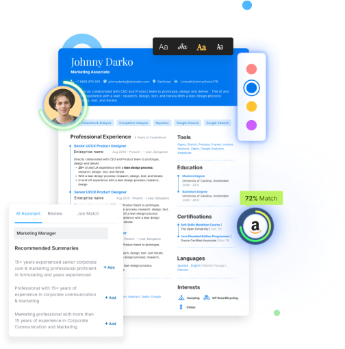
While content is key, the aesthetic appeal of your resume can be an influential factor in whether your resume makes it to the interview stage.
Therefore, choosing the best font to use for your resume is crucial as it can make a significant impact on how your resume is perceived.
Going ahead, we will explore the different aspects of the best font for your resume, including the following factors:
Why Choosing the Right Font is Important?
Choosing the right font for your resume is essential because it can make or break your chances of getting hired.
A poorly chosen font can make your resume look unprofessional and difficult to read, leading hiring managers to discard it quickly.
Our best font for resume suggestions will majorly focus on the trending ATS-friendly fonts in 2023.
Times New Roman and Arial are one of the best fonts for resumes for getting past ATS. Cambria, Georgia, Calibri, and Verdana are also more or less equally ATS-friendly fonts.
Readability
When it comes to choosing a font for your resume, readability should be your top priority.
A font that isn't easy to read can cause eye strain and irritability, leading to you losing out on the job.
Here are some of the most readable fonts:
-
Calibri - Calibri is a sans-serif font that is easy to read both on screen and in print. It has become the default font for Microsoft Word and is a popular choice for resumes.
-
Arial - Arial is another popular sans-serif font that is easy to read. It is a good choice for resumes because it is widely available and looks professional.
-
Georgia - Georgia is a serif font that is easy to read and has a classic look. It is a good choice for people in creative fields or for those who want to add some personality to their resume.
Professionalism
You also want to be very careful about choosing a font that looks professional.
A professional font contributes to your resume's readability and aesthetic value. Here are some of the most professional fonts:
-
Times New Roman - Times New Roman is a classic serif font, and it won't be wrong to say that it is older than time. It is a good choice for people in traditional fields such as law, finance, or academia.
-
Helvetica - Helvetica is a versatile sans-serif font that has a modern and clean look. It is a good choice for people in creative fields or for those who want to add a modern touch to their resume.
-
Garamond - Garamond is a serif font that has a classic and elegant look. It is a good choice for people in creative or artistic fields.
Aesthetic Appeal
A visually appealing font can help your resume stand out from the crowd and make you more memorable to a hiring manager.
Here are some of the most visually appealing fonts:
-
Verdana - Verdana is a sans-serif font that is easy to read and has a modern look. It is a good choice for people in creative fields.
-
Cambria - Cambria is a serif font that has a classic and elegant look. It is a good choice for people in traditional fields or for those who want to add some personality to their resume.
-
Didot - Didot is a serif font that has a luxurious and high-end look. It is a good choice for people in creative or artistic fields.
Also read: How to set cover letter margins and font spacing?
Font Size for Resume
What is the best font size for a resume?
In addition to choosing the right font, you also want to make sure that it is the right size.
The size of the font can make a big difference in how well your resume is received by hiring managers. Here are some tips to select font size for your resume:
-
Headings - Headings should be between 14 and 16 points.
-
Subheadings - Subheadings should be between 12 and 14 points.
-
Body Text - Body text should be between 10 and 12 points.
Hiration offers 4 standard font sizes: very small, small, medium, and large. The default font size is small, you can alter the size as per the content and length of your resume.
Typeface
Another important consideration when choosing a font for your resume is the typeface.
Typeface refers to the style and design of the font, including the shape of the letters, the spacing between letters, and the overall look and feel of the font.
Some popular typefaces include:
-
Serif - Serif fonts have small lines or flourishes at the end of each letter. They are often considered more traditional and formal. Examples of serif fonts include Times New Roman, Georgia, and Garamond.
-
Sans-serif - Sans-serif fonts do not have small lines or flourishes at the end of each letter. They are often considered more modern and casual. Examples of sans-serif fonts include Arial, Helvetica, and Calibri.
-
Script - Script fonts look like handwriting or calligraphy. They are often considered more decorative and used sparingly. Examples of script fonts include Brush Script, Lucida Script, and Vivaldi.
Color
If you are unwilling to go with the traditional b&w, adding a touch of color won't harm you. However, it is important to use color sparingly and strategically.
Here are some tips for using color on your resume:
- Use color to highlight important information, such as your name or contact information.
- Stick to one or two colors and use them consistently throughout your resume.
- Make sure the colors are professional and don't distract from the content of your resume.
Resume Font Combinations
If you want to use more than one font style, it is important to choose fonts that complement each other.
Here are some resume font combinations to consider:
-
Roboto and Open Sans - These two sans-serif fonts complement each other well and can be used for headings and body text.
-
Baskerville and Helvetica - Baskerville is a serif font that can be used for headings, while Helvetica can be used for body text.
-
Playfair Display and Lato - Playfair Display is a serif font that can be used for headings, while Lato is a sans-serif font that can be used for body text.
Font Trends in 2023
As design trends evolve, so do font trends. It is important to stay up to date to ensure that your resume looks modern and relevant.
Here are some font trends to consider:
-
Geometric Fonts - Geometric fonts have become increasingly popular in recent years. These fonts are characterized by their clean lines and modern appearance.
-
Handwritten Fonts - Handwritten fonts can add a personal touch to your resume and make it stand out from other applicants.
-
Variable Fonts - Variable fonts allow for greater flexibility in font design. These fonts can be adjusted in real-time to fit different screen sizes and resolutions.
Also read: Is a declaration needed in a resume and what is the declaration format for resume?
FAQs
-
What is the best font to use for a resume?
The best font for a resume is one that is clear, legible, and easy to read. Some popular choices include Times New Roman, Arial, and Calibri. -
Should I use a different font for my resume headings?
Using a different font for your resume headings can help them stand out and make your resume easier to navigate. However, it's important to choose a font that complements your body text and maintains consistency. -
Are there any fonts I should avoid using on my resume?
It's best to avoid using overly decorative or unusual fonts on your resume, as they can be distracting and difficult to read. Examples of fonts to avoid include Comic Sans, Papyrus, and Curlz.
Use Hiration's next-gen ChatGPT-powered career platform, which offers a solution to every obstacle faced by job seekers across the US.
Try it out today to enhance your job search and take your career to the next level. You can also reach out to us at support@hiration.com for any queries or concerns.
Frequently Asked Questions
-
What is the best font to use for a resume?
Use a font that is clear, legible, and easy to read. Popular choices include Times New Roman, Arial, and Calibri.
-
Which fonts are ATS-friendly for resumes?
You can use Times New Roman, Arial, Cambria, Georgia, Calibri, and Verdana as ATS-friendly choices.
-
What font size should you use for resume headings, subheadings, and body?
Set headings between 14 and 16 points, subheadings between 12 and 14 points, and body text between 10 and 12 points.
-
Should you use a different font for resume headings?
Yes. Using a different font for your resume headings can help them stand out, but choose a font that complements your body text and maintains consistency.
-
What are readable fonts for resumes?
Choose readable options like Calibri, Arial, and Georgia.
-
Which visually appealing fonts can you use on a resume?
Pick visually appealing choices such as Verdana, Cambria, and Didot.
-
What fonts should you avoid on a resume?
Avoid overly decorative or unusual fonts, as they can be distracting and difficult to read, such as Comic Sans, Papyrus, and Curlz.
-
What is the difference between serif and sans-serif fonts?
Serif fonts have small lines at the end of each letter and feel traditional and formal; examples include Times New Roman, Georgia, and Garamond. Sans-serif fonts do not have those lines and feel modern and casual; examples include Arial, Helvetica, and Calibri.
-
What are good resume font combinations?
Try Roboto with Open Sans, Baskerville with Helvetica, or Playfair Display with Lato.
-
What font trends should you consider in 2023?
Consider geometric fonts with clean lines, handwritten fonts for a personal touch, and variable fonts that adjust to different screen sizes and resolutions.